Craft Market Branding & Identity Design
We were soooo lucky to be brought on to execute this super happy brand refresh for The Makers and Shakers Market.
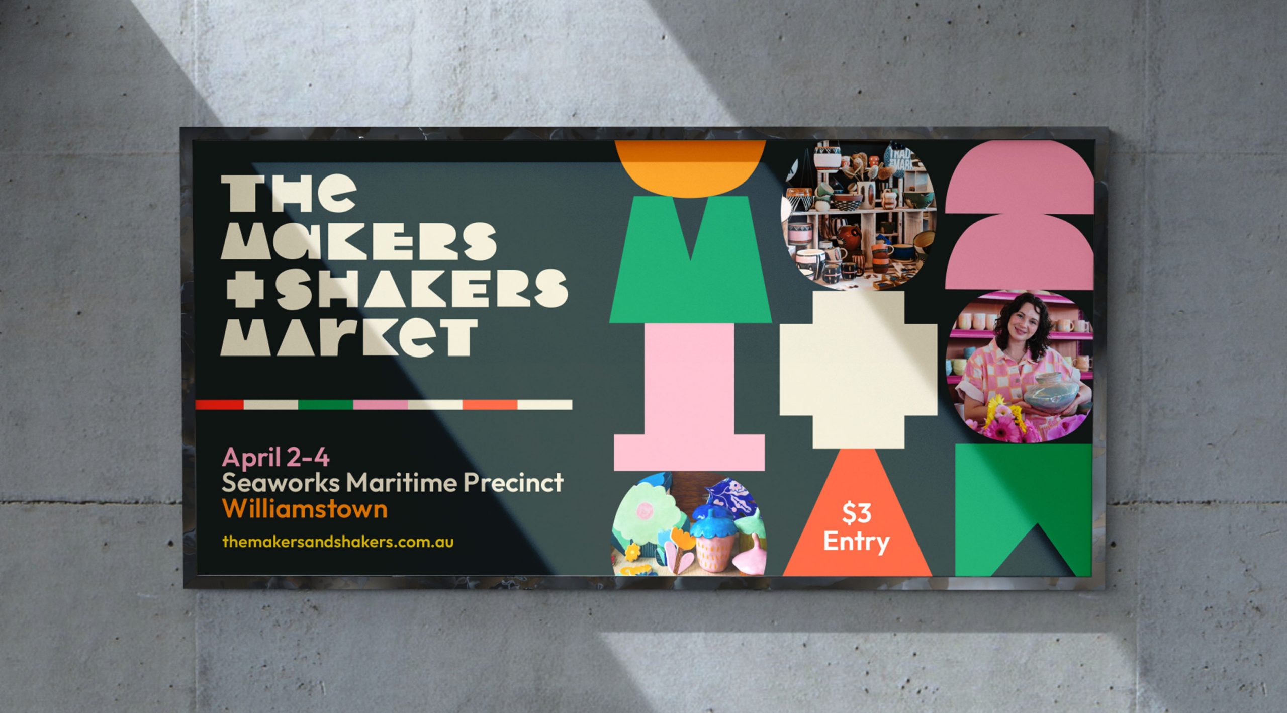
🌈😍 Working with the ideas of “community” and “making” to bring the brand to life, we loved brainstorming and playing with how these values could be made visual.
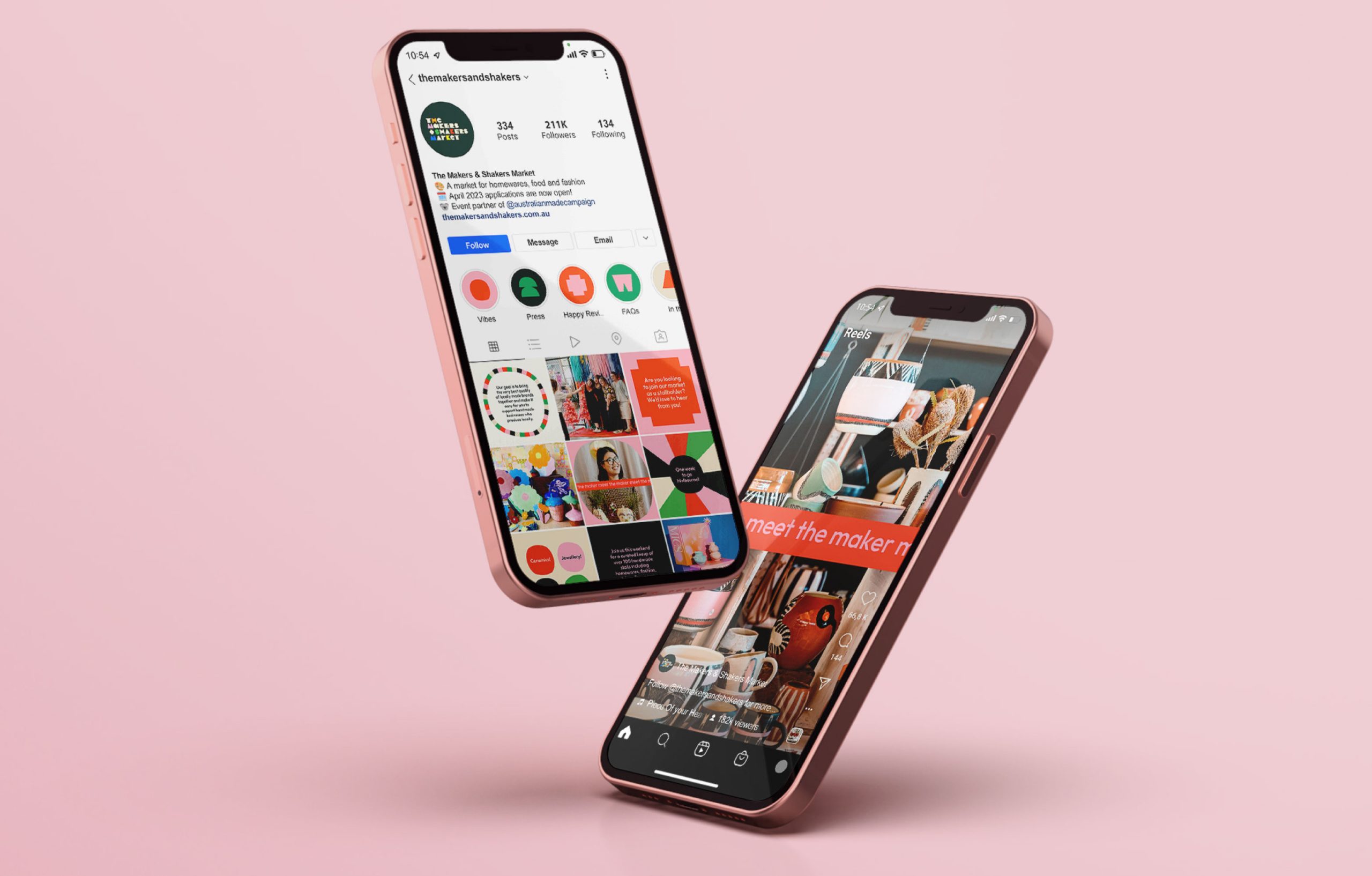
🌈 A huge multi-colour palette – the new branding reflects the different personalities and flavours that each maker brings to the market. Loads of different combos can be used, and we’ve specified some city-specific palettes from the lineup.
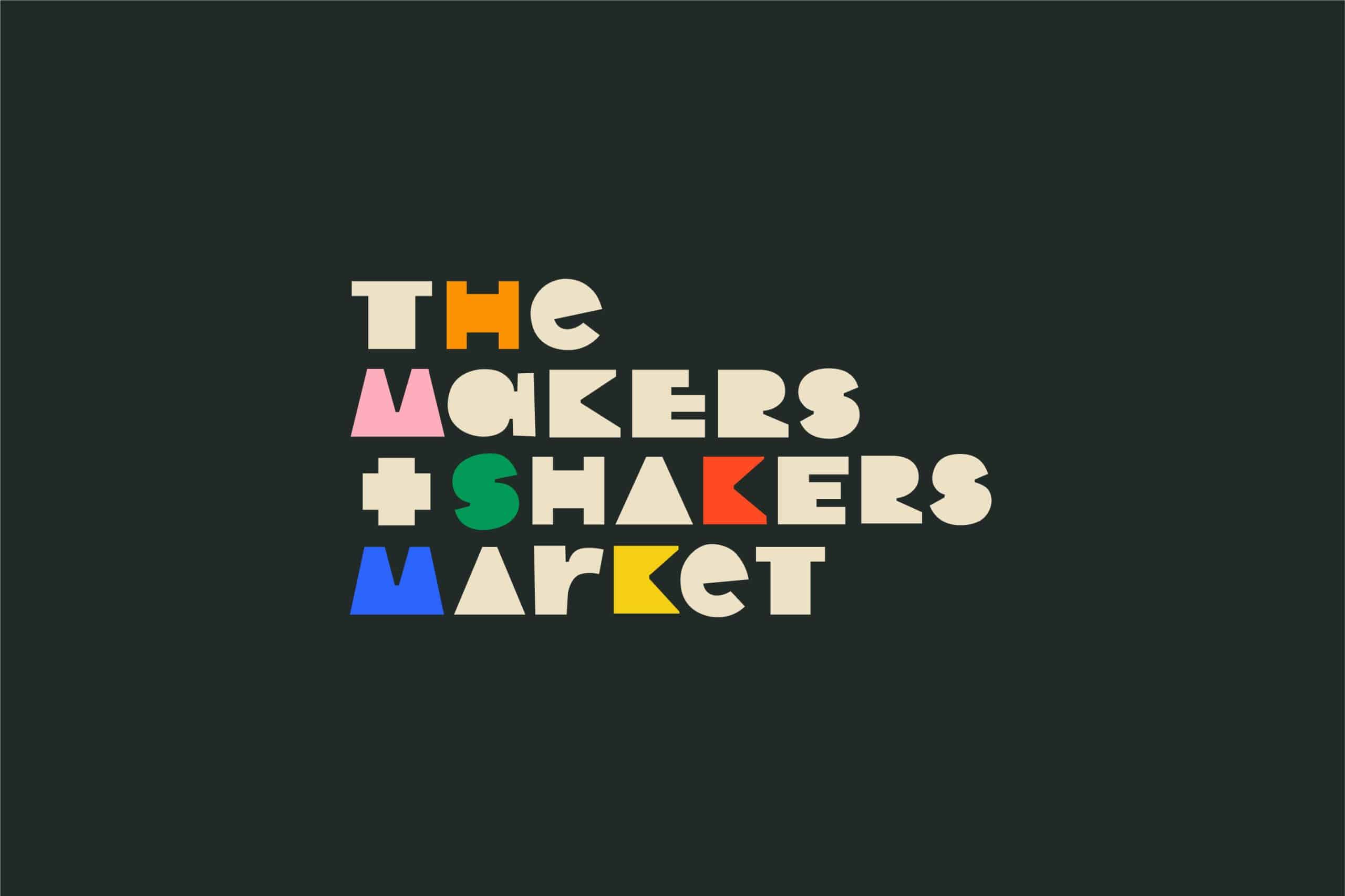
✂️ Choppy, collage-style shapes make up the bespoke typeface that we created, to really give it all that handmade touch
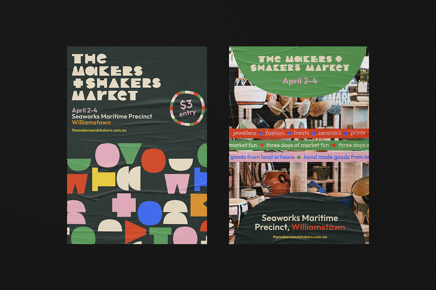
✨ 🟪 A collection of chonky brand shapes that come from the spaces made with the letterforms in the word mark – we played with these in lots of building blocks-style compositions to really drive home the feels of making, creating, building, constructing, etc.
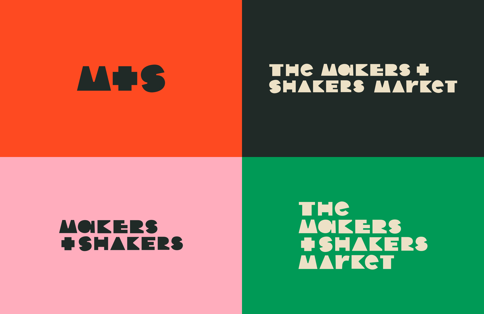
🛠️ Loads of different word mark and sub mark combos so there’s always the right logo to suit the space. Go check it all out at The Makers & Shakers Market in real life next time they’re in your town!
💖🌈✨

