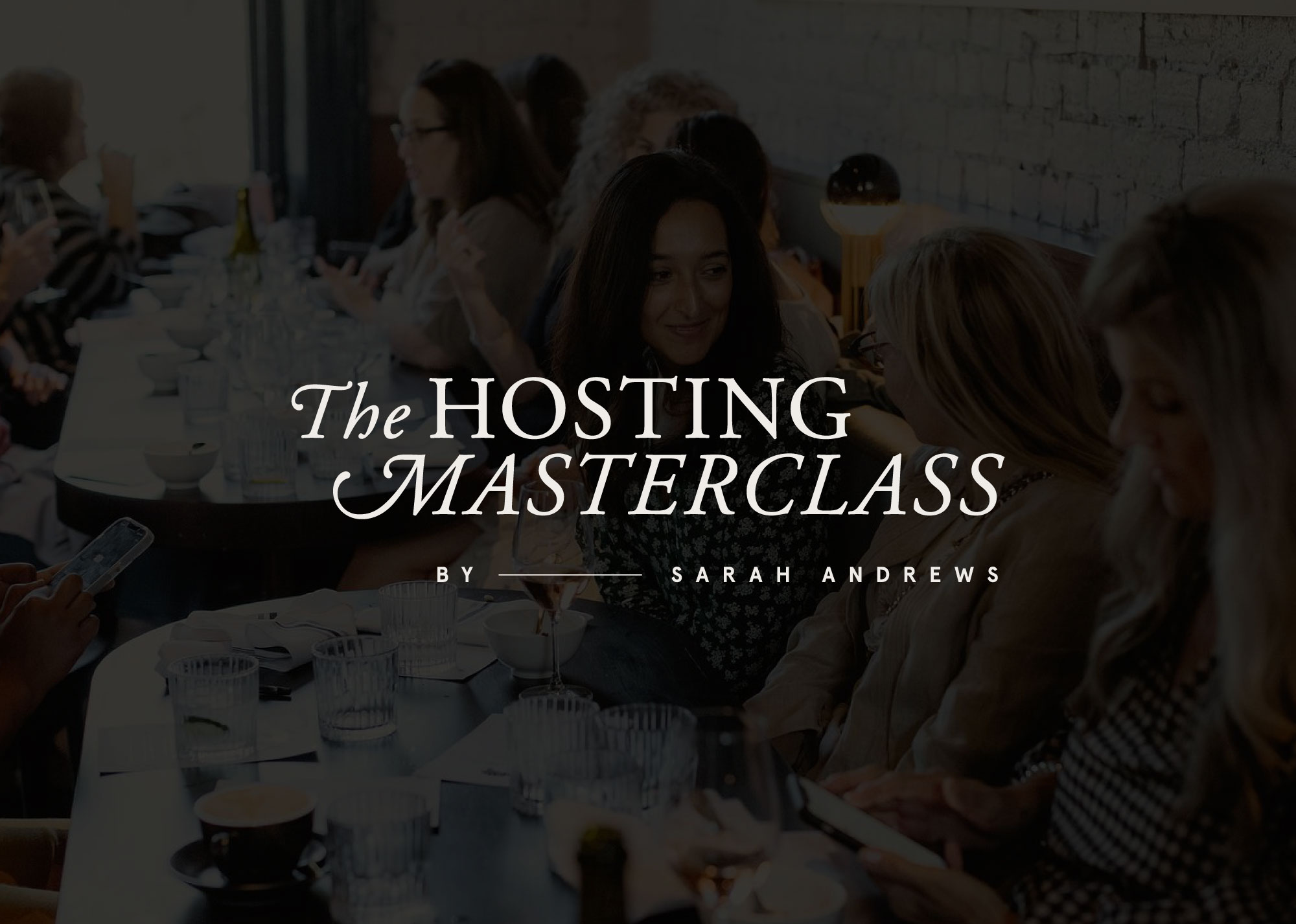
The Hosting Masterclass Brand Audit & Enhance
It is always such a pleasure when someone you admire reaches out for help making what they do even better, and this one got us excited! 🤩 Stylist, author, teacher, and explorer Sarah Andrews approached us to have a look at the branding of her online property styling course The Hosting Masterclass. After years as an established brand, Sarah felt that it was the right time to check in and assess where everything was at, and came to discuss updating the look and feel. We proposed our Brand Audit & Enhance package and began work together with her and her team to finesse the current brand assets and develop an expanded visual identity.
Aiming to keep the original brand elements as untouched as possible for brand strength, we began with a look at the logo and brandmark, and proposed some fine updates to the flow of the ligatures.
We gave the brand typography set an overhaul and introduced a new group of typefaces that would help further the messaging, keeping a sense of elevated timelessness alive and a clever mix of modern learning with a personal touch.
The colour palette 🎨 was something we felt was key to create as a good visual indicator to help represent community, diversity and timeless design, and we did this by introducing a large palette with a mix of brights, pastels, moody hues, and muted notes.
A delicious set of service illustrations was designed to give an old world look and feel and aid in the messaging for users across the website, the online course, and the workbook materials.
Finally, and most spectacularly, we had such fun building an initial library of graphic assets for play and interest across all comms. Made from found objects, artwork, paper ephemera, and so much more, this library can be drawn from in future.
All in all, a glorious piece of branding for a wonderful brand! 💖


